Choosing A Colour Palette to Suit Your Business Interior
It’s all just paint, right? Not exactly. If you are in the process of choosing paint colours for your business space you might want to read this article. You’ll discover that the colour palette you pick could affect your staff as well as reflect on your business as a whole. The colour of your business can subliminally create an image that reflects on the productivity and purpose of your workspace. Below are some tips for choosing a colour palette to suit your business interior.
Understanding The Psychology of Colours
Before you dip the brush into the paint, understanding the psychological impact of colours is crucial. Different paint colours evoke different emotions and can significantly affect the mood and productivity of your staff. For instance, blue is often associated with calmness and productivity, while red can stimulate energy and passion. This section will help you understand how specific colours can influence the atmosphere of your workspace.
Blue
Blue is a popular choice for businesses as it represents trust, stability, and productivity. It can also create a sense of calmness and relaxation, making it an ideal colour for offices that require focus and concentration.
Red
Red is the colour of energy, passion, and motivation. It can stimulate physical activity and increase heart rate, which makes it a great colour for businesses in the fitness or sports industry.
Green
Green is often associated with nature, growth, and balance. It can create a sense of harmony and healing, making it a suitable colour for businesses in the health and wellness sector.
Yellow
Yellow is known for its optimistic and cheerful vibes. It can evoke feelings of happiness and positivity, making it a great choice for businesses that want to create a warm and welcoming atmosphere.
Purple
Purple is often associated with luxury, creativity, and wisdom. It can add a touch of sophistication and elegance to your business space, making it an ideal colour for professional services such as law firms or financial institutions.
How to Choose a Colour Palette
Thinking about your colour palette
Picking the perfect colour palette for your interior painting project is no easy task! It requires a lot of thought and looking through inspirational sources. Here are some tips for deciding on where to get your colour palette from.
Do you have some different patterns or print in your space? Like, a great rug or artwork up on the wall or even a special textile, like a blanket. You can absolutely choose a dominant cover from a print or pattern in your space to help you churn out some complementary colours and a colour palette.
Think about colour values and the proper place and dominance they have in a room. It’s often suggested by professional painters or colour experts to have the darker colour values for the flooring (for example, a brown). Then you can do a medium colour value, like a beige or tan for the interior wall painting. And then a light cream or off-white for your ceiling painting. This helps to create a room that really works well in terms of a colour palette.
Finally, think about a cohesive colour palette or colour scheme for the main areas of your house first. If you have an open concept house with your kitchen, dining room and living room in one, it’s really important that the flow works well.

How to use a colour wheel for decorating
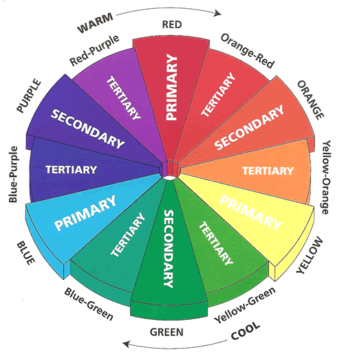
So, we’ve all seen a colour wheel before. Probably back in preschool even when we were just introduced to what a colour is. But as an adult a colour wheel can actually be helpful when you’re picking a colour palette for interior design purposes. Let’s look at a few different colour schemes which you can get off of a colour wheel!
Monochromatic colour scheme: A monochromatic colour scheme is always one of the easiest ones to create. Colour schemes done in a monochromatic way are simply made up of different shades, tones and tints within a specific hue. For example, if you’re going with blue, everything in your scheme will come from within the blue family.
Tetrad: A tetrad (or rectangular) colour scheme uses four colours made from two complementary colours. To help figure this one out more visually, if you can draw a rectangle between each of the colours you have chosen as your four, it can make a tetrad colour scheme. With this colour scheme, all four colours are evenly distributed around the colour wheel.
Complementary Colours: Complementary colour scheme is practiced when you use one base colour as well as its complement. The complement is located on the exact opposite side of the colour wheel. In terms of design, there is usually one colour as a base colour and its complementary colour is the accent.
Moreover, to learn about even more colour wheel schemes, visit our blog all about colour theory!
Colour Palette/Interior Paint Colour Suggestions:
One of the most common colour choices is blue. The colour blue symbolizes confidence, security, honesty, loyalty, and conservatism. Check out Labrador Blue for a blue that’s cool but not overly dark.
The second most popular is green. The colour green is associated with money, growth, the environment and calmness. A darker shade of green can be a symbol of prestige and high wealth. Green Monster is a beautiful shade of green that’s very rich.
“Power Colours” communicate confidence, control, and responsibility. These include: burgundy, dark green, and navy blue.
In order to counterbalance the strong message that navy blue projects you can combine it with an orange colour palette.
Turquoise is a colour that has been proven to stimulate creativity. If you are looking to paint the business interior of a marketing or advertising agency this may be a good paint colour for you and your employees.
Additional tips to picking a colour palette:
Something to remember when choosing paint colours for a business interior is that the brighter the shade, the less serious the office will appear (depending on the type of business, of course). You’ll need to consider the demographic of who will be working in the office and the clients who will be visiting. You want your business interior to reflect a professional atmosphere.
For example, if you are planning to paint a dental clinic or naturopath’s office, choosing colours that reflect calmness and serenity would be the most beneficial. They include interior painting colours like blue, green, and sometimes yellow.
To create a productive environment for your business interior choose a colour palette that’s a combination of green and blue. Make sure to incorporate some warmer colours to offset the colour palette and create a less stressful work environment.
If you paint the office with too much red, however, it may create mood changes and negative behaviour. On the other hand, too much orange or peach will result in a highly social environment that encourages talking. Those two colours would be great for a staff lounge but not necessarily where work will be done.
Lastly, if you have a business interior where extensive note taking and training will be done, incorporate yellow into the colour palette of the room. This interior painting colour has been known to assist people in taking in and retaining more information.
More Interesting Blogs Related to
“Picking a Colour Palette For Your Business”
Do you have a fairly large office that you need painted and are in need of professional painting services? Or maybe you just simply don’t have the time to deal with that right now. Our home painting services with the best house painters have been around now for over 35 years. Call 416.494.9095 or email [email protected] for a FREE quote for your home painting needs.


